Make them hear you.

It's all about you. Whether we're designing a logo, writing a press release, or
making a video, the project needs to get the job done and you need to love it!
I can deliver designs that work great on a tight budget or pull out all the
stops when you're looking for something swanky. You just need to call.

Design Square.JPG

GET THE LOOK

As a graphic designer, I make logos, flyers, newsletters, programs, CD covers, stickers, t-shirts, signs, forms, websites—everything from wine bottle labels to a US postage cancellation mark. I shoot event, portrait, and studio photos, and am skilled at photo retouching. And I can shoot and edit video. Call me to make your stuff look right.

My Design Work >

Writing.JPG

FIND THE WORDS

I offer thoughtful writing, careful editing, and obsessive proofreading services. I am a third-generation copywriter, following in the footsteps of my father and his father before him—it's our family trade! Let me help you with press releases, advertising, newsletters, instruction manuals, social media posts, editorial writing, and more.

More About My Writing >

branding Montpelier.JPG

deliver the message

Each point of contact with your audience is another chance to make the right impression. Together we can craft a brand identity just for you (and I can help you understand just what that is and why it's so important). I'd also be happy to assist with your marketing and publicity needs. Contact me to explore the ways we can reach your people.

Branding Examples > 

Design projects start with questions. And end with answers!

It's not enough to look pretty if the design does not do the job of communicating
your message. I'll start by working with you to discover what we need
to accomplish, and then it's my job to find a way or make one. 

 
The Have Dreams organization creates opportunities for people with autism, and their logo is a kite soaring in the wind. I was happy to provide a clean and elegant new look for their annual golf classic fundraising event.

The Have Dreams organization creates opportunities for people with autism, and their logo is a kite soaring in the wind. I was happy to provide a clean and elegant new look for their annual golf classic fundraising event.

 
The author was thrilled with this book cover photo and design. She wanted an image of feet on a dirt path but it was the dead of winter, so I arranged for the local conservatory to let us use their desert room for a photo shoot.

The author was thrilled with this book cover photo and design. She wanted an image of feet on a dirt path but it was the dead of winter, so I arranged for the local conservatory to let us use their desert room for a photo shoot.

Don’t forget the back of the book: it needs to invite the reader in and carry out the design from the front as well. Michele wrote me, “Thanks again for your beautiful work—the design was exactly what I wanted!”

Don’t forget the back of the book: it needs to invite the reader in and carry out the design from the front as well. Michele wrote me, “Thanks again for your beautiful work—the design was exactly what I wanted!”

A fun assignment: photographing the South Bend Civic Theatre’s production of My Fair Lady. I could have danced all night!

A fun assignment: photographing the South Bend Civic Theatre’s production of My Fair Lady. I could have danced all night!

The Ripple Effect choir is all about respecting differences, so for their signature concert I created an image of brushes of all sizes, shapes, and colors, each contributing to make a rainbow of stripes. We used it on the posters and programs.

The Ripple Effect choir is all about respecting differences, so for their signature concert I created an image of brushes of all sizes, shapes, and colors, each contributing to make a rainbow of stripes. We used it on the posters and programs.

We kept the look friendly but clean and professional for this video production company’s anniversary invitation, and left some space for an optional handwritten note.

We kept the look friendly but clean and professional for this video production company’s anniversary invitation, and left some space for an optional handwritten note.

Nothing bothers me more than a form that is hard to use (for the person filling it out or for the person retrieving the information). It’s a special passion of mine to try to make life a little better for everyone through functional design, and it i…

Nothing bothers me more than a form that is hard to use (for the person filling it out or for the person retrieving the information). It’s a special passion of mine to try to make life a little better for everyone through functional design, and it is so rewarding to make a form that works. Sometimes it’s all business, like an intake form for a drug testing lab, and sometimes you get to have a little more fun for Trivia Night! (By the way, I designed that National Laboratories logo.)

For an informal wedding on a budget, we had the most important pieces commercially printed, and produced others on the bride’s home printer.

For an informal wedding on a budget, we had the most important pieces commercially printed, and produced others on the bride’s home printer.

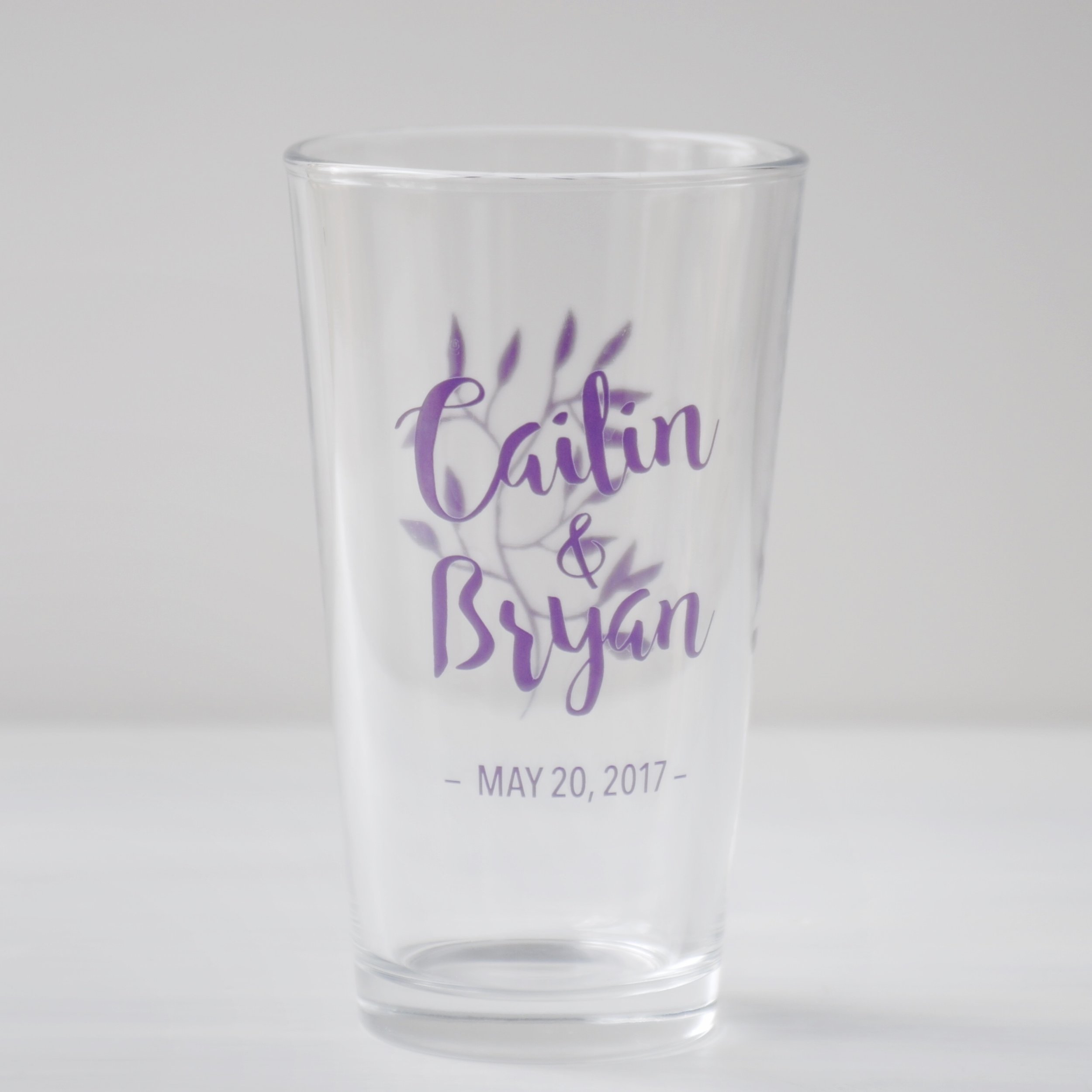
I reproduced elements from the invitation on these souvenir pint glasses, with printing on the front and back.

I reproduced elements from the invitation on these souvenir pint glasses, with printing on the front and back.

Flowers and leaves make a pretty pattern on the back of the invitation.

Flowers and leaves make a pretty pattern on the back of the invitation.

A logo for a conference on the environment to be held at a Catholic university. I designed it to work well in a variety of sizes and applications: it could be printed on a giant banner or stitched on a ball cap.

A logo for a conference on the environment to be held at a Catholic university. I designed it to work well in a variety of sizes and applications: it could be printed on a giant banner or stitched on a ball cap.

Logo design for an earth-to-table food festival in Virginia, seen here on a coffee cup. Their previous logo was all about the food, but the actual event was all about process, with chances to meet the food producers and watch chefs at work, so we ma…

Logo design for an earth-to-table food festival in Virginia, seen here on a coffee cup. Their previous logo was all about the food, but the actual event was all about process, with chances to meet the food producers and watch chefs at work, so we made that point with some tools of the trade.

I made this logo and business card design for a cool old building in Tennessee that can be rented for events. We wound up printing these on a rustic tan paper and they look great. The client said, "You totally got what I was going for!! What a think…

I made this logo and business card design for a cool old building in Tennessee that can be rented for events. We wound up printing these on a rustic tan paper and they look great. The client said, "You totally got what I was going for!! What a thinking designer! I love it. I love it. I love it!"

This business card for bluegrass musician Chris Jones needed to be done in a hurry. We produced the artwork in two-and-a-half hours from the time he called me to time it went off to the printers. My miraculous contacts at Printsource in Charlottesvi…

This business card for bluegrass musician Chris Jones needed to be done in a hurry. We produced the artwork in two-and-a-half hours from the time he called me to time it went off to the printers. My miraculous contacts at Printsource in Charlottesville, VA had the cards beautifully printed and delivered on the doorstep in just two business days, and gave us an amazing price. A good relationship with a professional printer is worth a fortune!

I wrote this bio for Chris early in his career, and it's a good example of economical printing. With just one color ink and no bleed, it could be reproduced on any copy machine. I used the same design elements but a different color of paper for each…

I wrote this bio for Chris early in his career, and it's a good example of economical printing. With just one color ink and no bleed, it could be reproduced on any copy machine. I used the same design elements but a different color of paper for each piece of the promo kit, and the finished product was quite handsome.

I've had a lot of fun creating CD and cassette tape packaging for musicians John Pennell, Eric Uglum, Ron Block, Copperline, Hwy 52, and the San Diego Bluegrass Club. Really getting to know the artists and the music allows me to match the images and…

I've had a lot of fun creating CD and cassette tape packaging for musicians John Pennell, Eric Uglum, Ron Block, Copperline, Hwy 52, and the San Diego Bluegrass Club. Really getting to know the artists and the music allows me to match the images and design to their individual styles.

The covers get a lot of attention, but the discs and the insides of the booklets should not be an afterthought. I love to carry out the design to every part of the packaging.

The covers get a lot of attention, but the discs and the insides of the booklets should not be an afterthought. I love to carry out the design to every part of the packaging.

Logo for a "home church" in Indiana. The Venn diagram highlights their focus on the things that unite the group while honoring their differences.

Logo for a "home church" in Indiana. The Venn diagram highlights their focus on the things that unite the group while honoring their differences.

A presentation I produced in 2011 for James Madison's Montpelier, using Apple Keynote. This piece was designed to play in a kiosk display, and welcomed visitors to the Old Library room where James Madison did the critical thinking and writing that formed the basis for the Constitution. I was given the script and the recorded narration, and added the musical underscoring and all of the visual elements.

A logo for the combined newsletter and website of the San Diego Bluegrass Society and the Bluegrass Association of Southern California. I chose the name "inTUNE" to reinforce the cooperation between the two groups, but it also lent itself to calls t…

A logo for the combined newsletter and website of the San Diego Bluegrass Society and the Bluegrass Association of Southern California. I chose the name "inTUNE" to reinforce the cooperation between the two groups, but it also lent itself to calls to action: "Get inTUNE!" The horizontal lines of the logo suggest the fingerboard of a stringed instrument or the lines of a musical staff, without being too literal.

As assistant director of communications at James Madison's Montpelier, I had a chance to design all kinds of fun things! A2Z Design developed a wonderful look-and-feel for our printed collateral, and I carried out that style for all our in-house pie…

As assistant director of communications at James Madison's Montpelier, I had a chance to design all kinds of fun things! A2Z Design developed a wonderful look-and-feel for our printed collateral, and I carried out that style for all our in-house pieces.

A self-mailing brochure for the Archaeology Department at James Madison's Montpelier. I liked scattering the little artifacts on the mailing panel to invite you to open the brochure. I took a few of the photos, too.

A self-mailing brochure for the Archaeology Department at James Madison's Montpelier. I liked scattering the little artifacts on the mailing panel to invite you to open the brochure. I took a few of the photos, too.

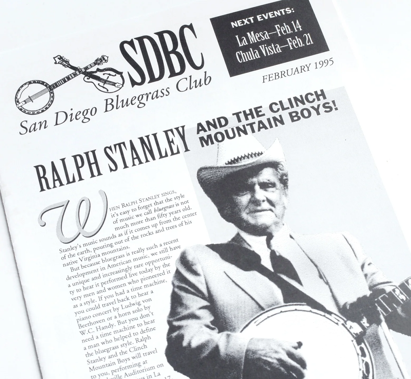
Another example of effective low-budget design. Also, Ralph Stanley's agent liked my writing in this article so much, he used bits of it in Ralph's own PR kit for years.

Another example of effective low-budget design. Also, Ralph Stanley's agent liked my writing in this article so much, he used bits of it in Ralph's own PR kit for years.

You have something to say.

You don't have to know exactly what you want to say or how to say it. I can help get your thoughts together and put them into words. Convincing words. Poetic words. Words that call to action.

I'm also an excellent editor and project manager, as well as a fearsome proofreader. So I can keep your project on budget and on time, and catch those pesky typos.

Persuasive writing has always been natural for me, but I also took college courses in advertising copywriting and public service campaigns. I know how to format your press release to get the attention of a busy editor, and how to use a call to actio…

Persuasive writing has always been natural for me, but I also took college courses in advertising copywriting and public service campaigns. I know how to format your press release to get the attention of a busy editor, and how to use a call to action in advertising copy. Most importantly, I can identify what you have to offer that your audience will value, and write about it from the heart.

I have done a lot of editing and project management for publications, so I can keep your project moving forward. I can find images and negotiate for the right to reproduce them if necessary, and I can be your interface with designers and printers or…

I have done a lot of editing and project management for publications, so I can keep your project moving forward. I can find images and negotiate for the right to reproduce them if necessary, and I can be your interface with designers and printers or website builders. I know how to build a practical budget and production schedule and keep those on track, too.

I'm also a doggedly determined proofreader, with research skills for fact-checking, and knowledge of Chicago and AP styles. Above are two of my toughest assignments for proofing, a cookbook and the text of the US Constitution. But my highest-stress …

I'm also a doggedly determined proofreader, with research skills for fact-checking, and knowledge of Chicago and AP styles. Above are two of my toughest assignments for proofing, a cookbook and the text of the US Constitution. But my highest-stress proofreading job was a list of donors to be inscribed on the wall of a visitor center. Hey, it's not like we're carving it in stone! Oh, wait… (By the way, we had no typos.)

Take every chance to show who you are.

Your brand identity is more than just a logo, typefaces, and colors. Every contact you make with the public says something about you, whether you have thought about it or not! Let's make sure you don't miss any opportunity to get your point across. I can help with branding, marketing, press relations, publicity, and ad campaigns.

The branding guide I created for Montpelier included instructions for using the logo, and for use of our palette of colors and set of typefaces. But it also covered every element of our brand identity, from the texture of papers to the names of plac…

The branding guide I created for Montpelier included instructions for using the logo, and for use of our palette of colors and set of typefaces. But it also covered every element of our brand identity, from the texture of papers to the names of places on the property.

It may seem picky, but it gave a unified voice to our communications, which helped to reinforce our identity at every point of contact with our visitors.

In its first year, the edibleFEST had a confusing variety of looks, with a rack card designed by the local tourism bureau, a very different-looking ad designed by the magazine in which it ran, and a website with yet another visual identity. I pulled…

In its first year, the edibleFEST had a confusing variety of looks, with a rack card designed by the local tourism bureau, a very different-looking ad designed by the magazine in which it ran, and a website with yet another visual identity. I pulled these all together into a unified appearance for all communications, with a style we applied to business cards, banners, promotional kits for prospective sponsors, name tags, and everything connected to the festival. A few of the pieces are above.

Through consistent repetition, people will be able to recognize your materials before they even read them, and will see that you have your act together.